Introduction
In the last lesson, we learnt about user interfaces, which are the means by which a person interacts with a computer system.
We also learned about two different types of user interfaces: text-based interfaces and speech or natural language interfaces.
These are just two types of user interfaces, though. There are many others that we may use in our personal and work lives.
In this lesson, we’ll learn about:
- Graphical User Interfaces
- Sensor Interfaces
- Menu/Form Interfaces

Graphical User Interfaces
A graphical user interface, or GUI (pronounced Gooey), is the type of interface that you and I most commonly use daily.
It is often also known as a WIMP interface. WIMP stands for Windows, Icons, Menus, and Pointers.
You see, a graphical user interface makes use of images to provide a visual display of what you are interacting with on the computer.
These images are normally organised into:
- Windows – an interface item that separates different programs.
- Icons – a graphic that, when clicked on, runs a program or takes you to a folder or file.
- Menus – a list of actions grouped together to allow you to run them quickly.
- Pointers – a representation of the user’s point of control (i.e. where they have moved the mouse).

Graphical User Interfaces
We can see an example of this type of interface in Figure 1 below.
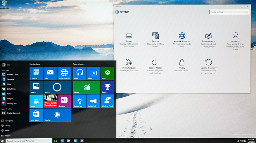
One area where graphical user interfaces slightly differ is in mobile devices like smartphones. These use a GUI, but of course, we don’t have an on-screen pointer because our finger is the pointer.

Pros & Cons of Graphical User Interfaces
Advantages
A graphical user interface is intuitive for most users. This makes it a good interface for beginners and doesn’t require extensive training to learn how to use it.
We can have multiple windows on screen, allowing us to see multiple programs and move data between them easily, such as dragging and dropping or copying and pasting text from one Word document to another.

Pros & Cons of Graphical User Interfaces
Disadvantages
A GUI is typically much more memory and processor-intensive than other types of interfaces. The graphics that make up the interface are stored in memory and must be processed to display them correctly.
Performing tasks often involves navigating through several windows, which can be time-consuming. This might be compared to other interfaces, such as a text-based interface, which might perform the task in one simple command.

Graphical User Interfaces
Despite some of these disadvantages, the interface is so much easier and more intuitive than alternative interfaces that it has become the de facto interface for most modern computer systems, such as desktops, laptops, smartphones, and tablets.
The disadvantage of being processor and memory-intensive is not as much of an issue in modern computers that have powerful processors and lots of memory.
The fact that it can be slower than a text-based interface is true only if you know the commands, which most computer users don’t.

Sensor Interfaces
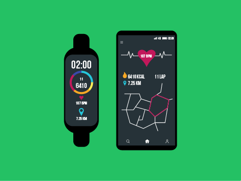
A sensor is a device that reads physical data, such as the temperature.
With a sensor interface, a computing device will use sensors that read this physical data and then perform actions based on the information it gathers.
A simple example of this might be your home’s central heating system.
You might set the temperature to 22 degrees. The central heating system will monitor the room temperature using a sensor and automatically turn on or off your heating based on what the sensor reads.
It’s not just temperature sensors, though. Sensors can detect light, sound, rainfall, window speed, pressure, motion, and much more.
Sensor Interfaces
Advantages
We can constantly monitor for changes in the environment so that actions can be performed in response much quicker and more accurately.
There is no human interaction required. The actions are performed automatically based on readings, making it more efficient and less subject to human error.
Disadvantages
This type of interface can only be used for specific, limited functionality. You couldn’t use it to write a report or work out your taxes. Just for simple cause-and-effect actions.
Sensor interfaces require specialist equipment to setup, and this can often be quite expensive.

Sensor Interfaces
While this type of interface has only very limited purposes, we do see it used all the time, and this is increasing as many “smart home” devices rely on this type of interface.
For example, your smart central heating, home security, and lighting systems. They’re also used a lot in hospitals for monitoring patients, such as their heart rate and oxygen levels.

Menu/Form Interfaces
This type of user interface presents the user with a menu that contains a list of options. The user navigates through sub-menus by choosing the relevant option to perform the function they want.
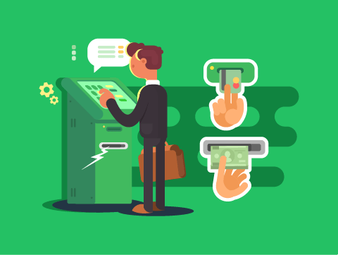
This type of user interface is used in many self-service kiosks. For example, cash machines at the bank and self-service tills at the supermarket both commonly use menu-based interfaces.
Many fast-food restaurants also have self-service kiosks that use menu-based interfaces to choose your meal.
Menu/Form Interfaces
These examples we’ve talked about are all also typically graphical interfaces. However, we can have text-based and speech-based menu interfaces.
You might have called a business phone line and been told:
- Press 1 for sales
- Press 2 for customer support
- Press 3 for anything else
This is also a menu-based interface.

Pros & Cons of Menu/Form Interfaces
Advantages
This is a very easy-to-use interface. Its simplicity, with limited possible actions and clear options, makes it very user-friendly.
The interface is very easily adapted to different users. In particular, it is easy to translate into various languages, and the options can be spoken rather than just visual.
Disadvantages
A menu-based interface can be very frustrating for users if there are a lot of different levels of sub-menus, as this can take a long time to navigate.
Options are limited, so more complex actions cannot be performed. If the required option is not available, you will not be able to complete your task.

Menu/Form Interfaces
As we’ve seen, a menu-based interface is really simple to follow but can only be used for a small number of simple functions.
This is why the most common place we see menu-based interfaces is in self-service kiosks, such as those on a cash machine or the self-service machine at a fast-food restaurant.

Lesson Summary
A graphical user interface (WIMP interface) uses images to provide a visual display of what you are interacting with on the computer.
It’s easy to use and move data around but is processor-intensive & less efficient than some other interfaces.
A sensor interface will read physical data and then perform actions based on the information it gathers.
It can be quick, accurate & automated, but it can be limited in function and expensive.
A menu-driven interface presents the user with a menu with a list of options. This is used in self-service kiosks such as ATMs.
It is easy to use and easily adaptable but can be frustrating and is limited in function.
